TellUs Case 1 of 4
Rebuilding how 600k+ customers a year report a claim
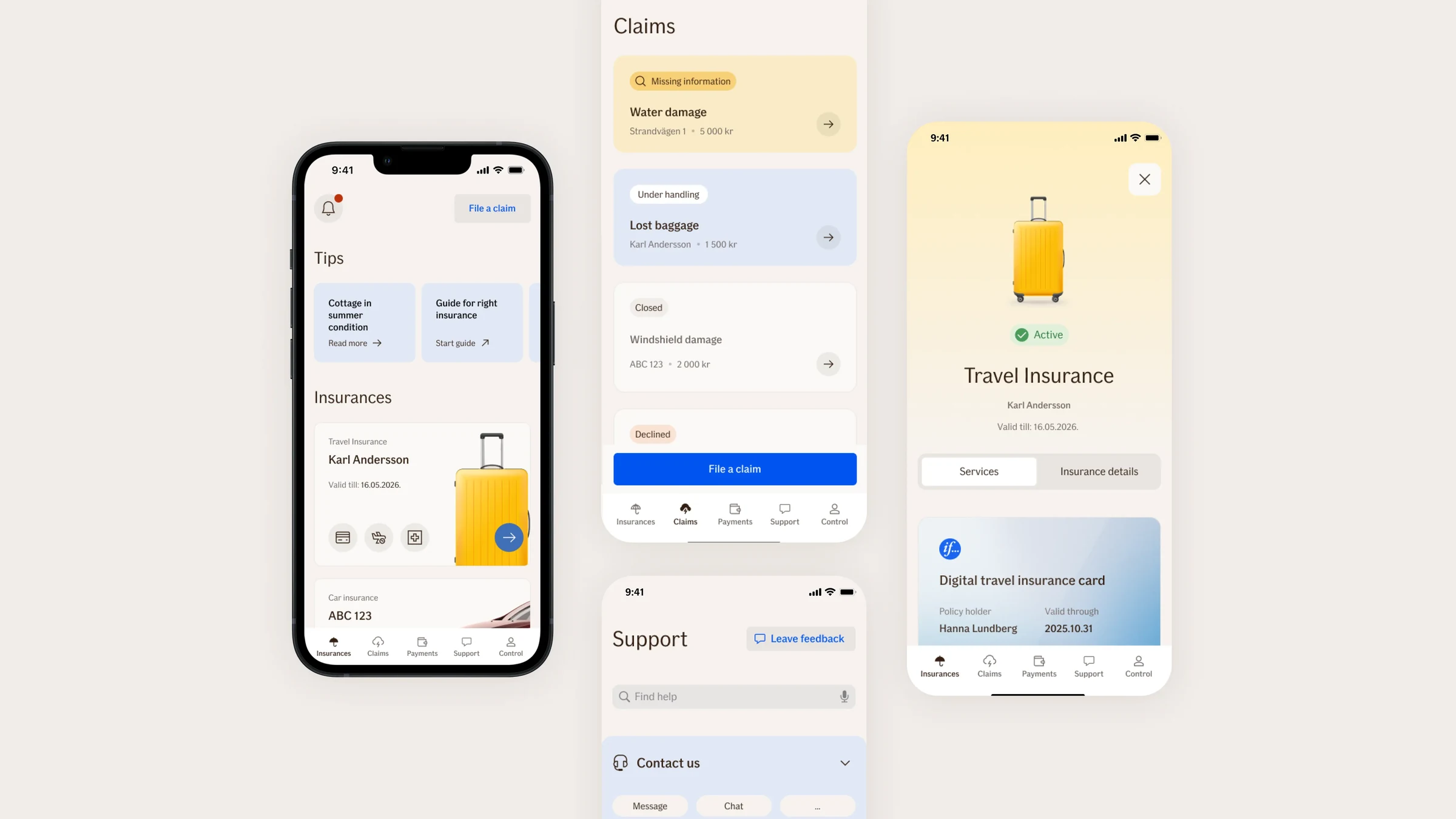
A conversational claim form for 600k+ customers a year, built on a themeable system of reusable components. I was its product designer and owner.
In short
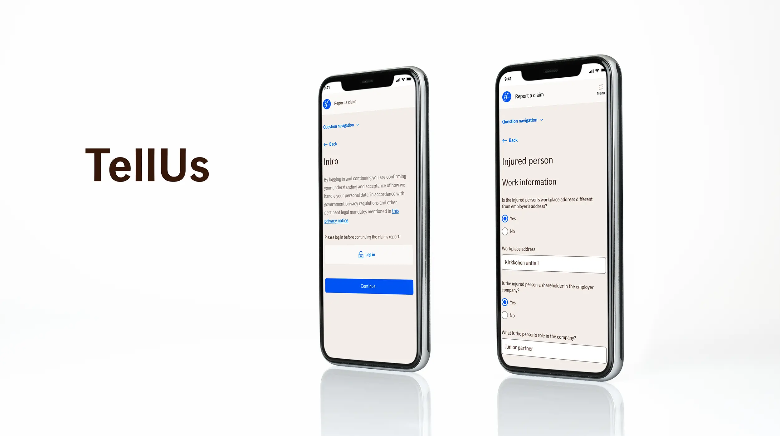
The old claims intake solution was a chat, and it had been on everyone’s mind for a long time. It was harder to use than it should have been, and it left real user problems unsolved.
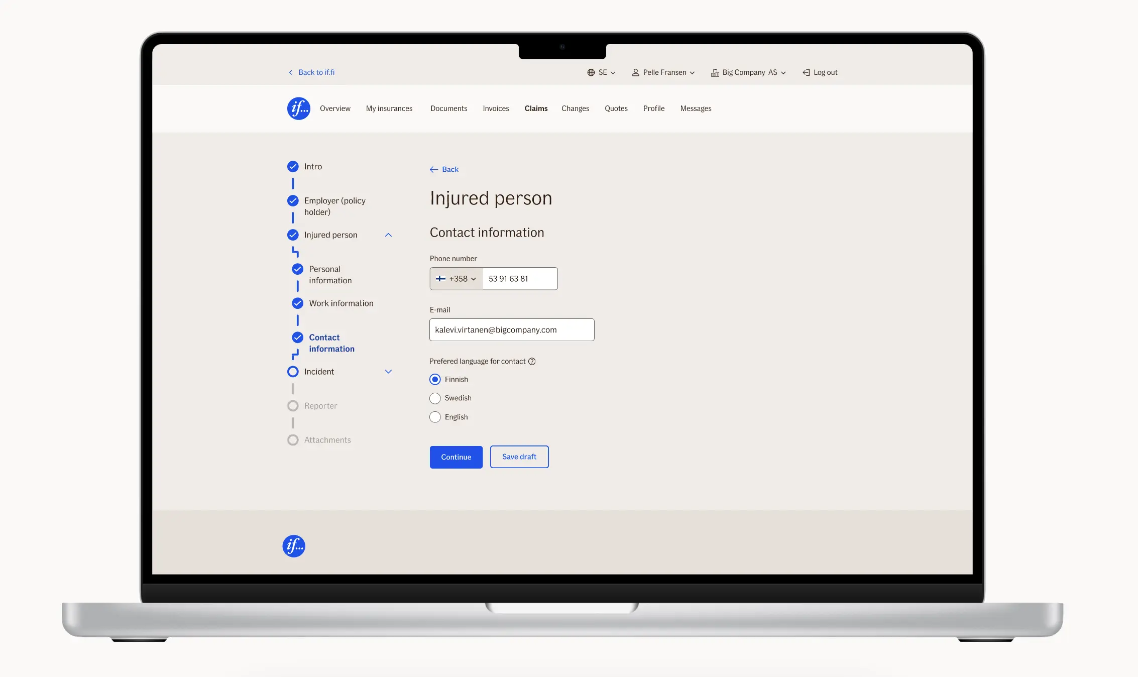
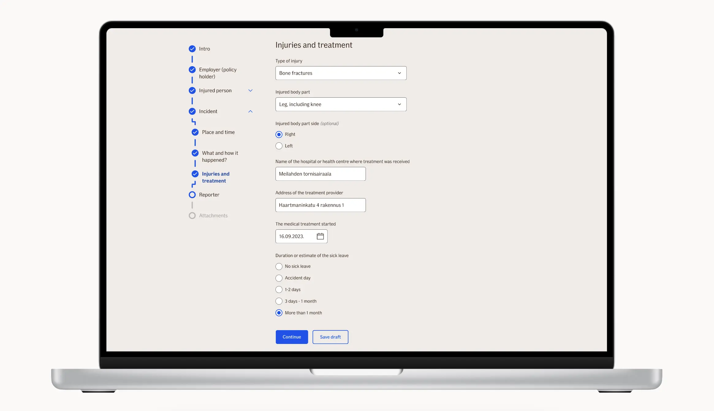
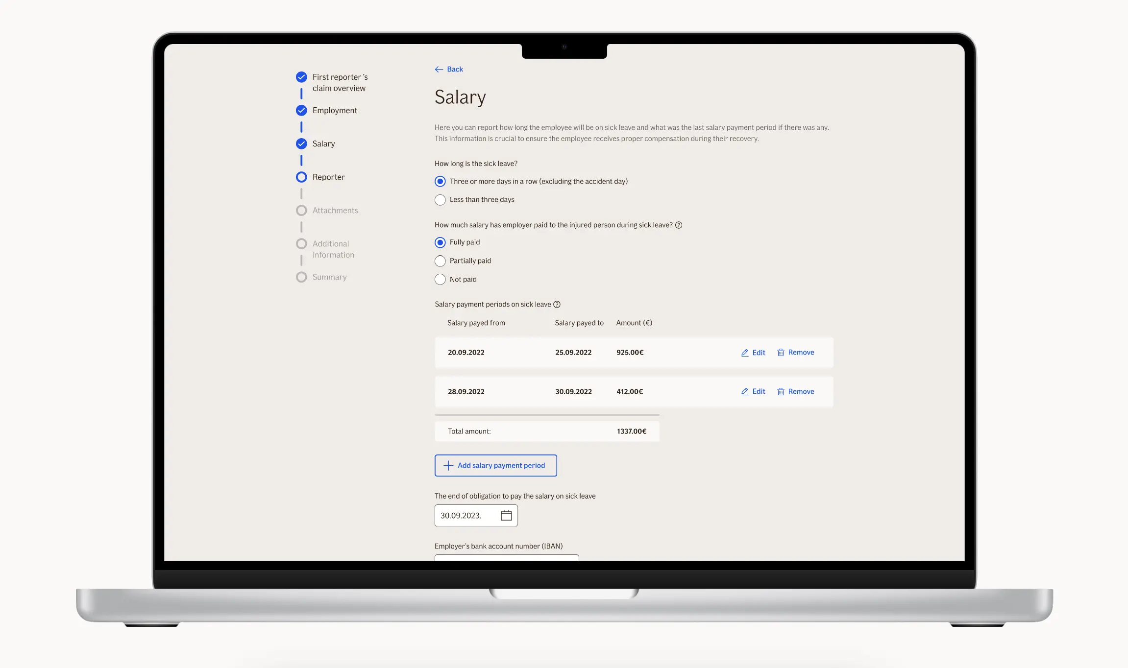
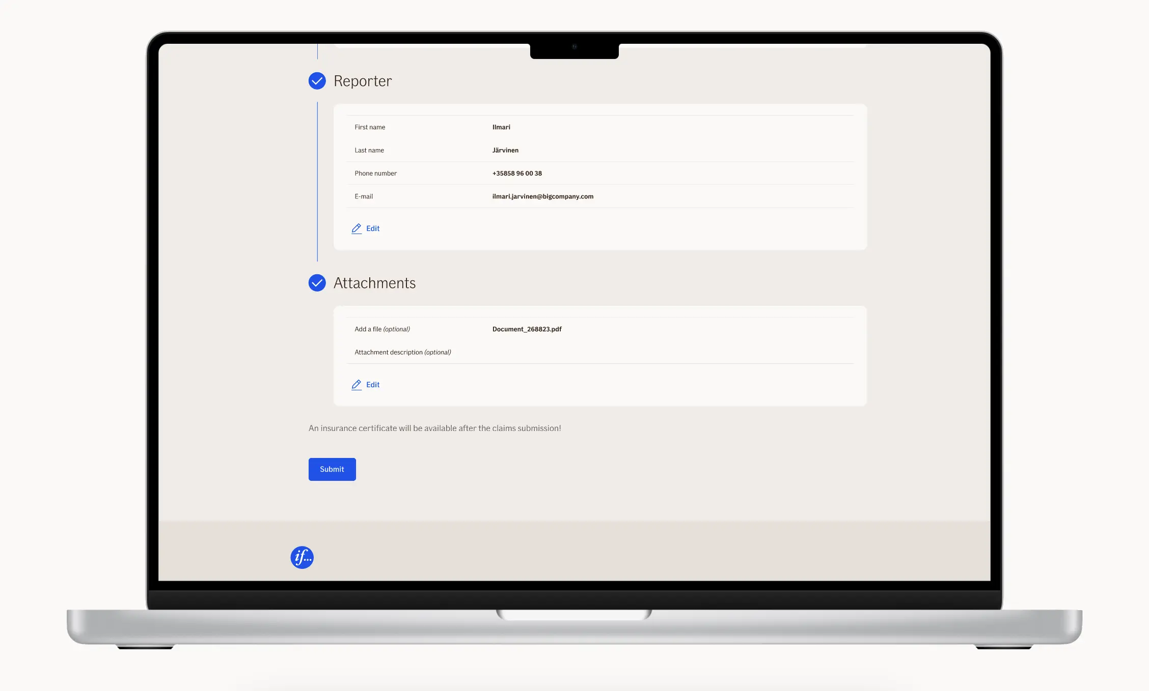
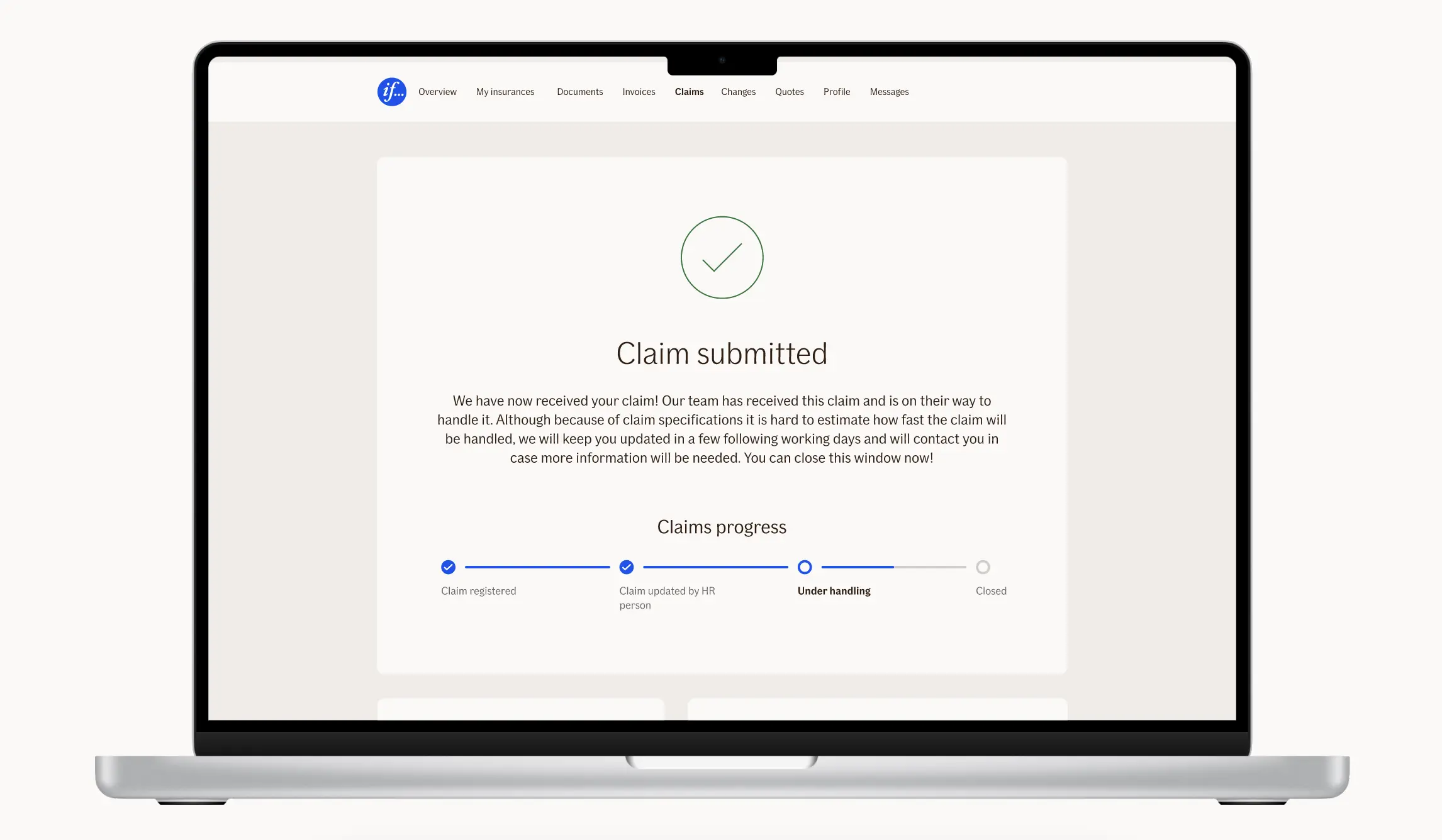
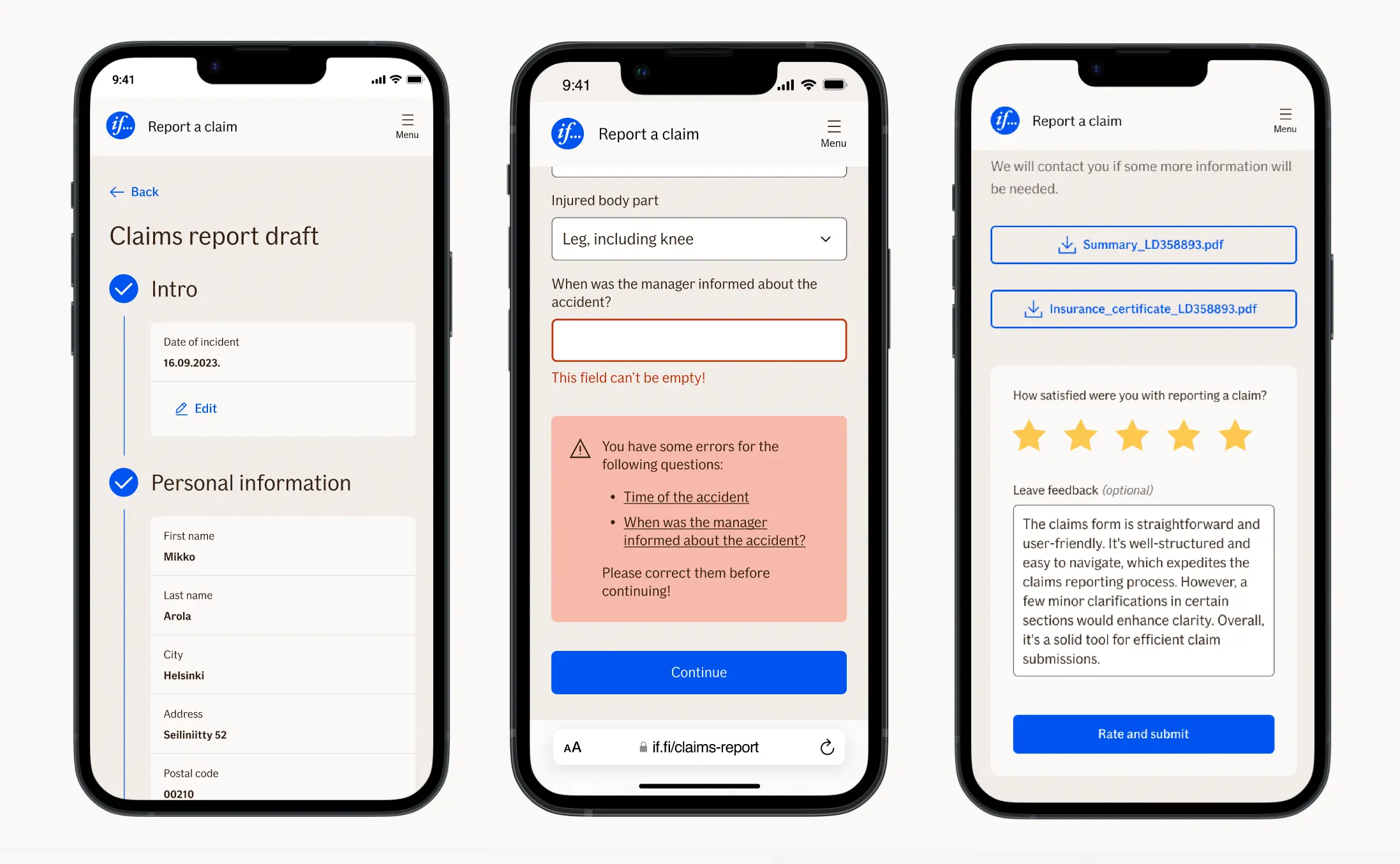
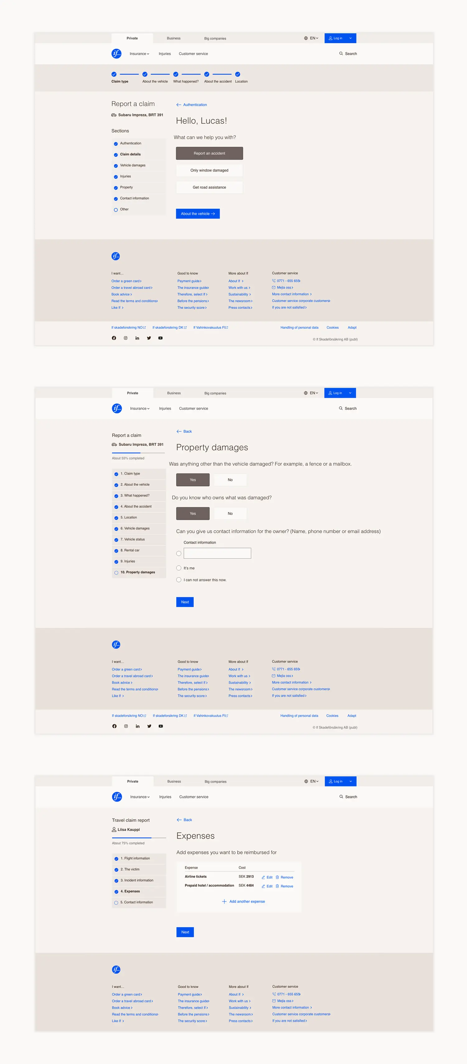
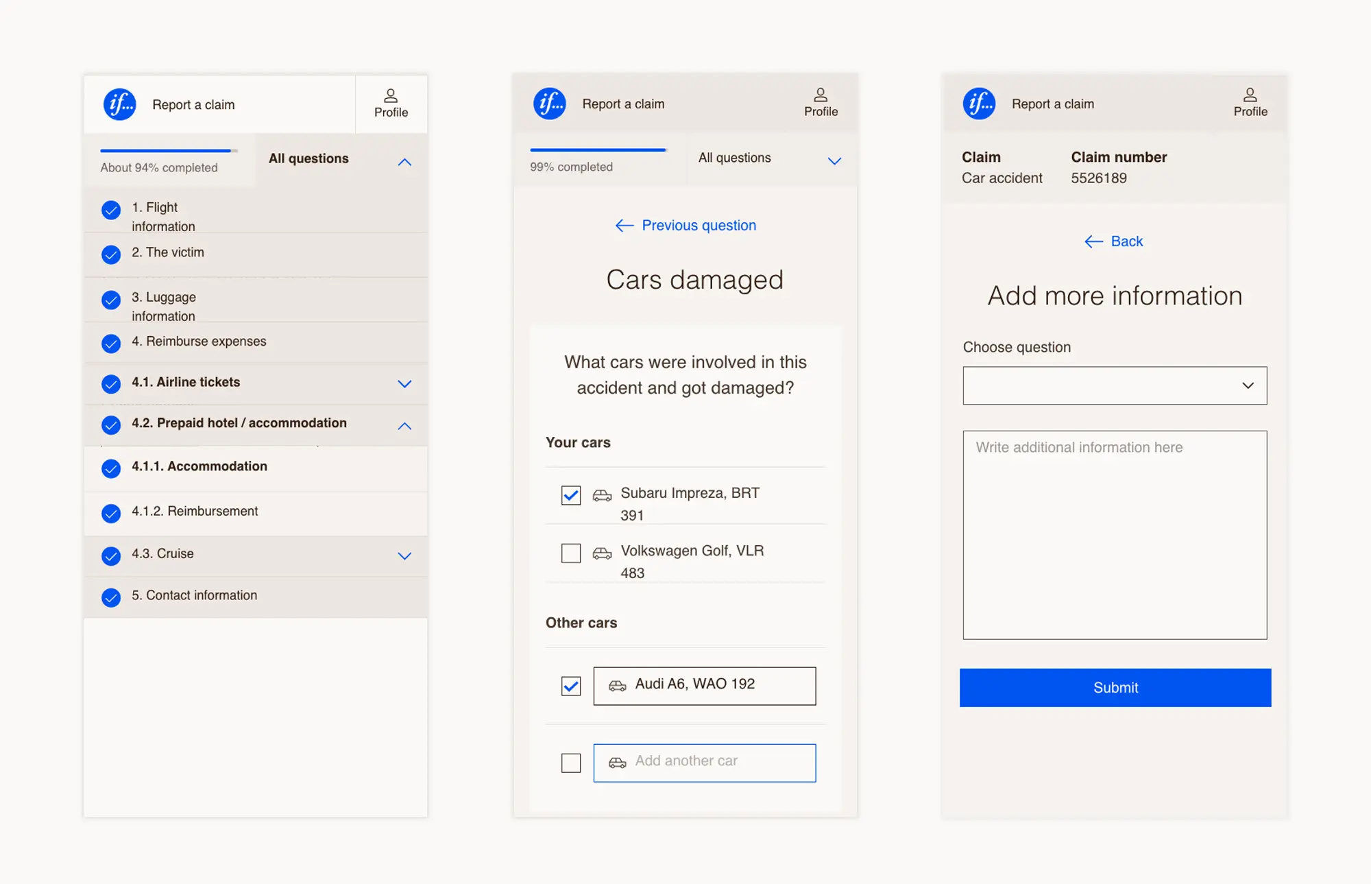
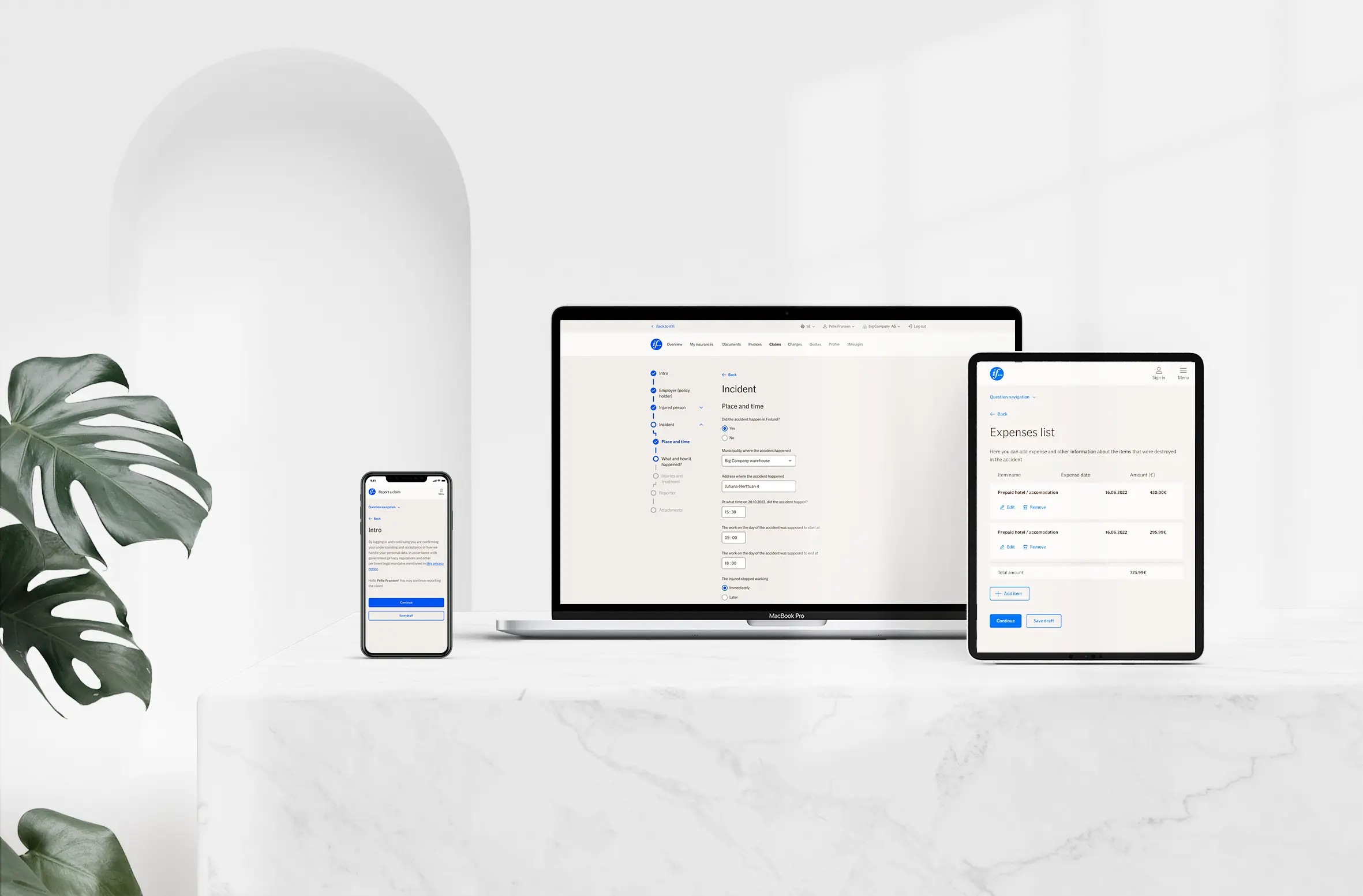
TellUs replaced it with a conversational form. It guides people through their claim in plain language, shows where they are, saves their draft, and points to the exact question when something is missing. Today it runs for 600k+ customers a year, customers are happier with how reporting a claim works, and more teams across If keep adopting it.
Goal
Customers report a claim on their own, without guessing, and find it easier than before.
Success metrics
- Customer satisfaction with reporting a claim
- Completion rate
- Drop-off by step
- Time to report a claim
- Share of claims reported online
- Teams and countries adopting it
- Partner sites using the forms
My role
I was both the product designer and the product owner of TellUs: discovery, design, backlog, priorities, and the conversations about what not to build.
The team was spread across the Nordics and the Baltics, so a lot of my work was keeping everyone on the same problem.
Decisions that shaped it
A conversation, not a form
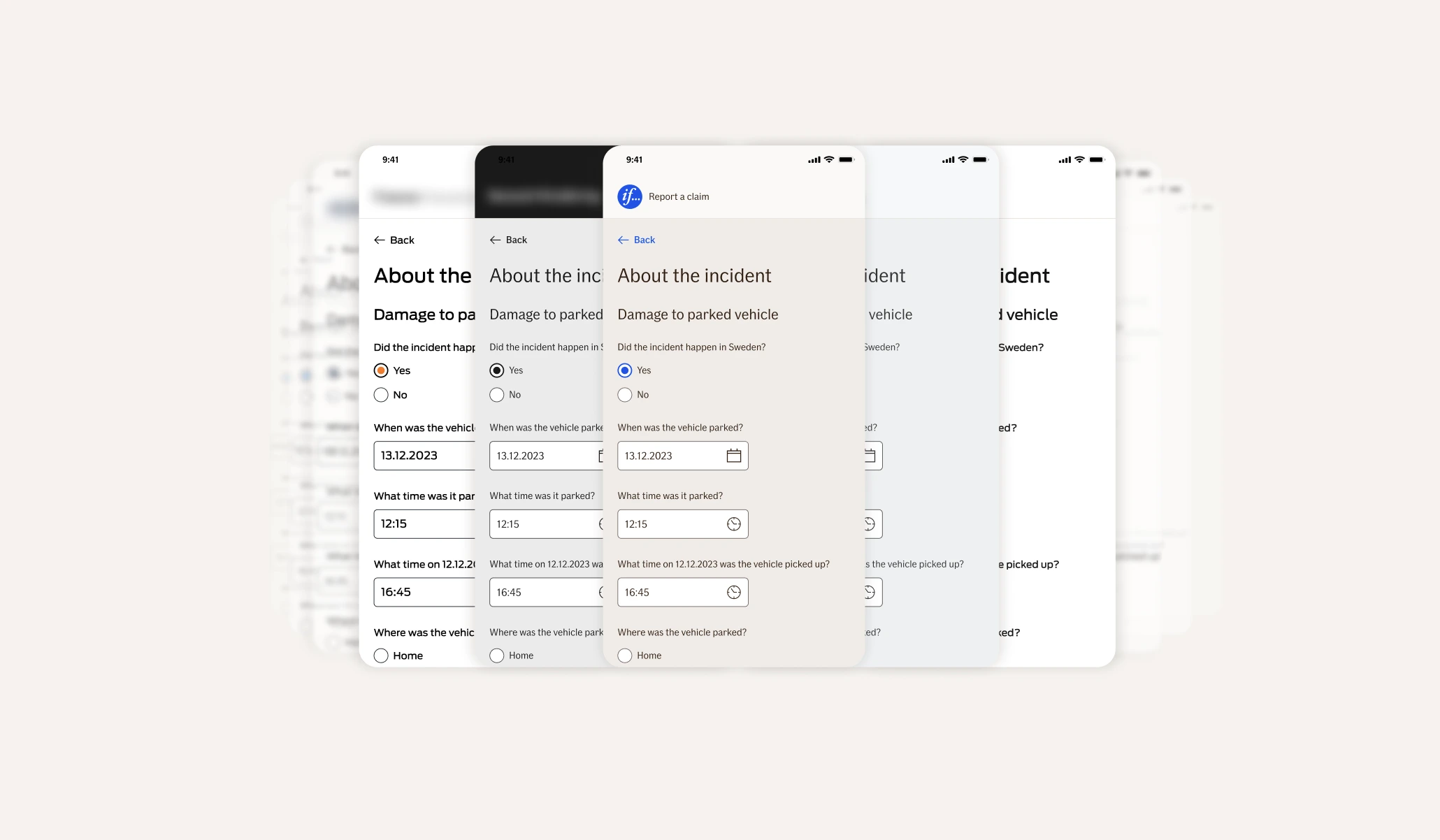
People report claims on a bad day. Instead of facing a long form, they’re guided through what happened in plain language, the way a good claims handler would ask.
Ask only what the claim needs
Every question in a claim is personal data, sometimes about someone’s health. Together with the business developers who build each country’s claim forms, every question is carefully crafted to support both the customer and the business, and nothing is asked that the claim doesn’t need.
Accessible and on-brand by default
TellUs is built to WCAG 2.1 level AA, the accessibility level our Nordic markets require, and follows If’s design system on any screen. That’s why other teams could pick it up without a redesign.
One form, any brand
Colours, type and components live in one Figma library, and the code uses the same design tokens. Teams build new forms from ready-made components and styles instead of starting from scratch, and every form stays consistent and accessible by default.
The tokens also make theming easy. Partners who sell our insurance get the same forms on their own sites, in their own branding: we change the theme, not the form.
How we got there
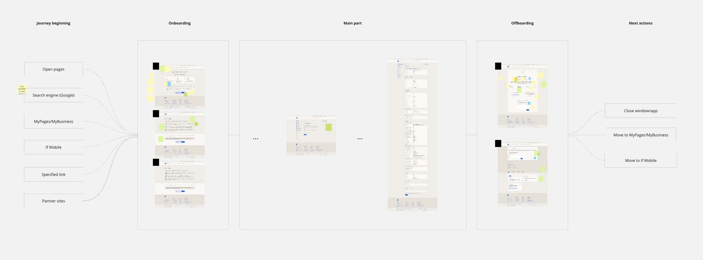
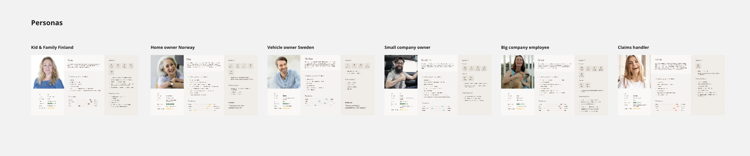
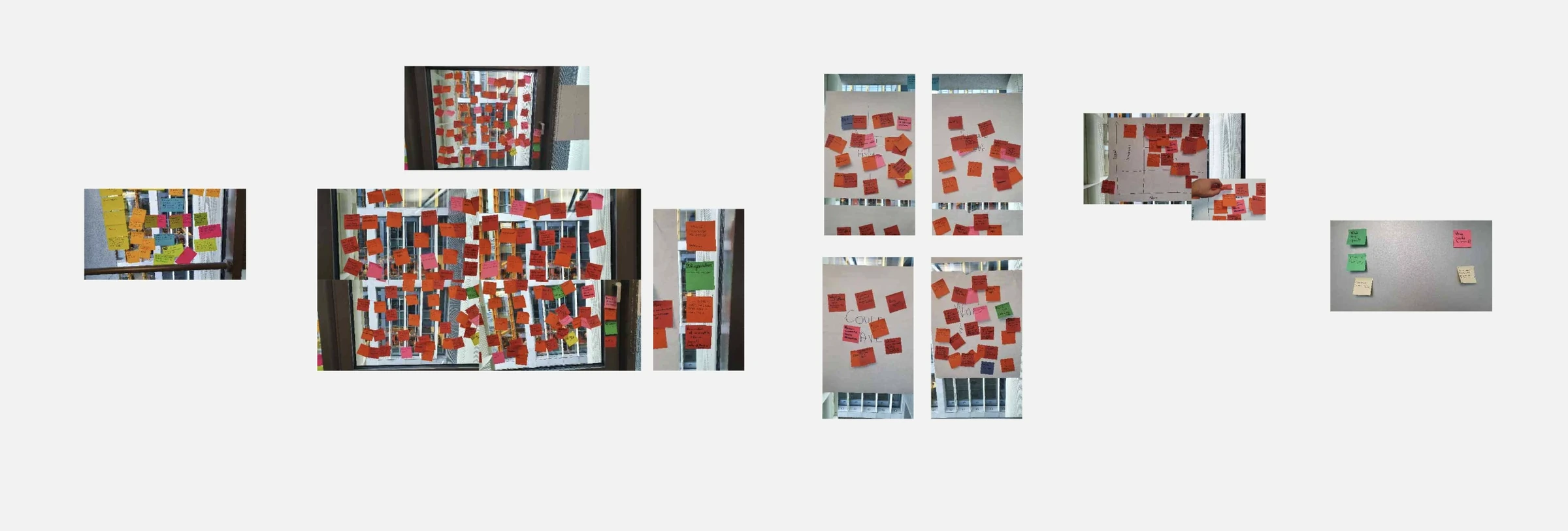
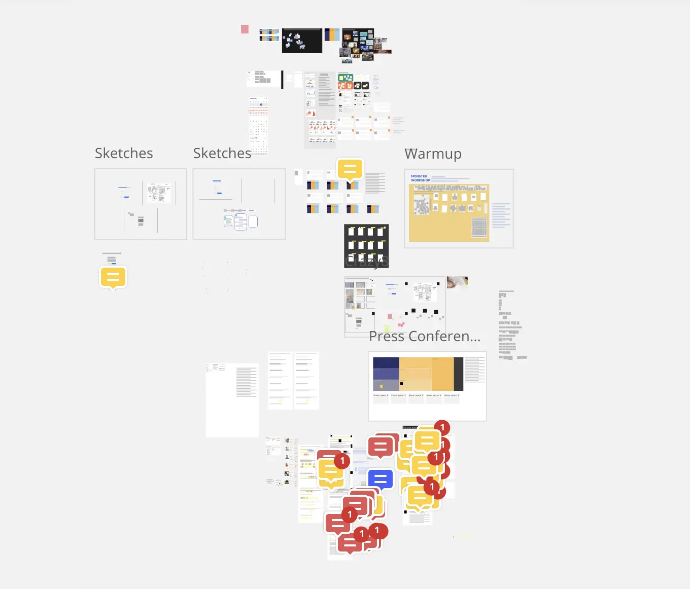
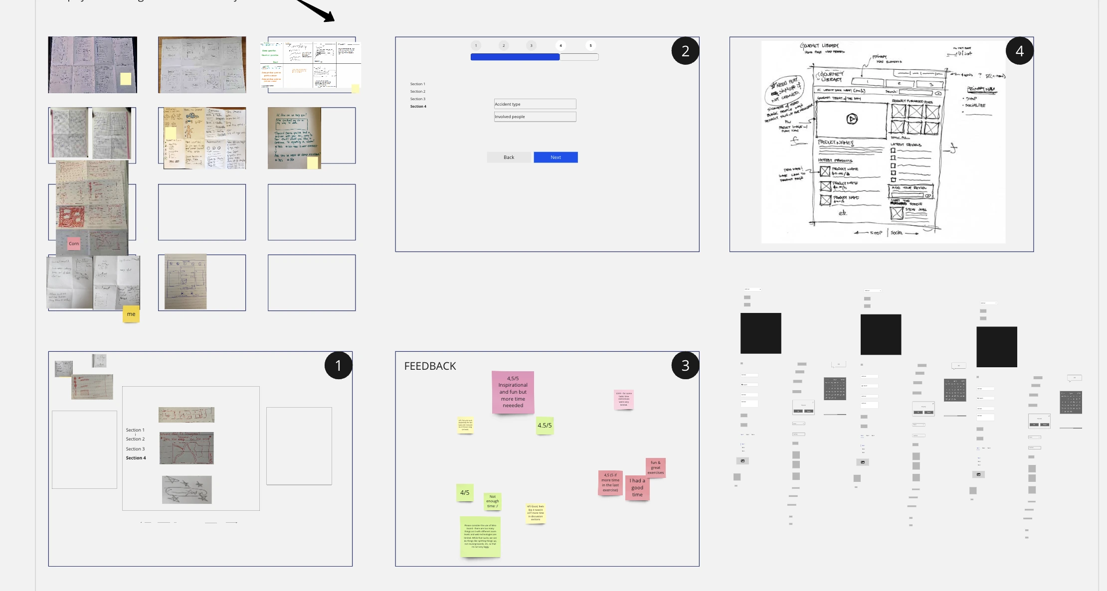
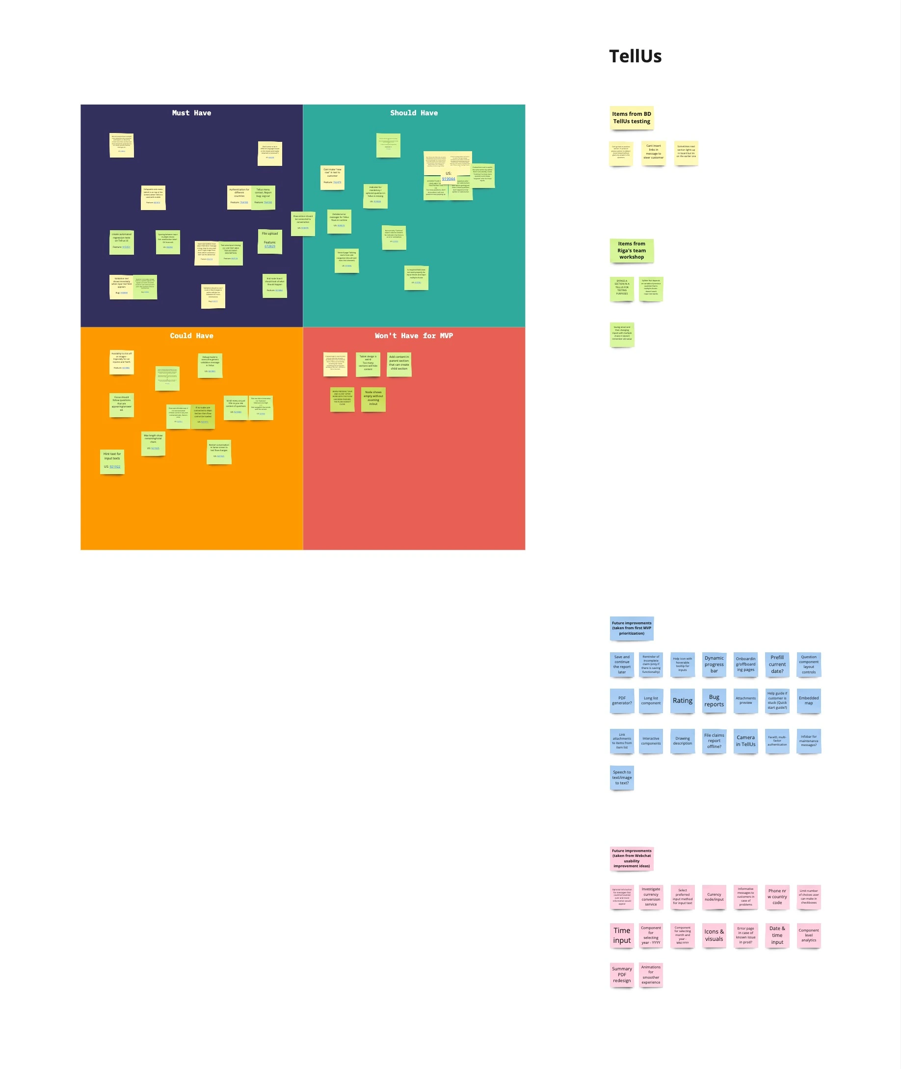
Feedback analysis and interviews with users and stakeholders gave us six personas. Then we sketched together, because a room full of people with markers beats one designer alone.
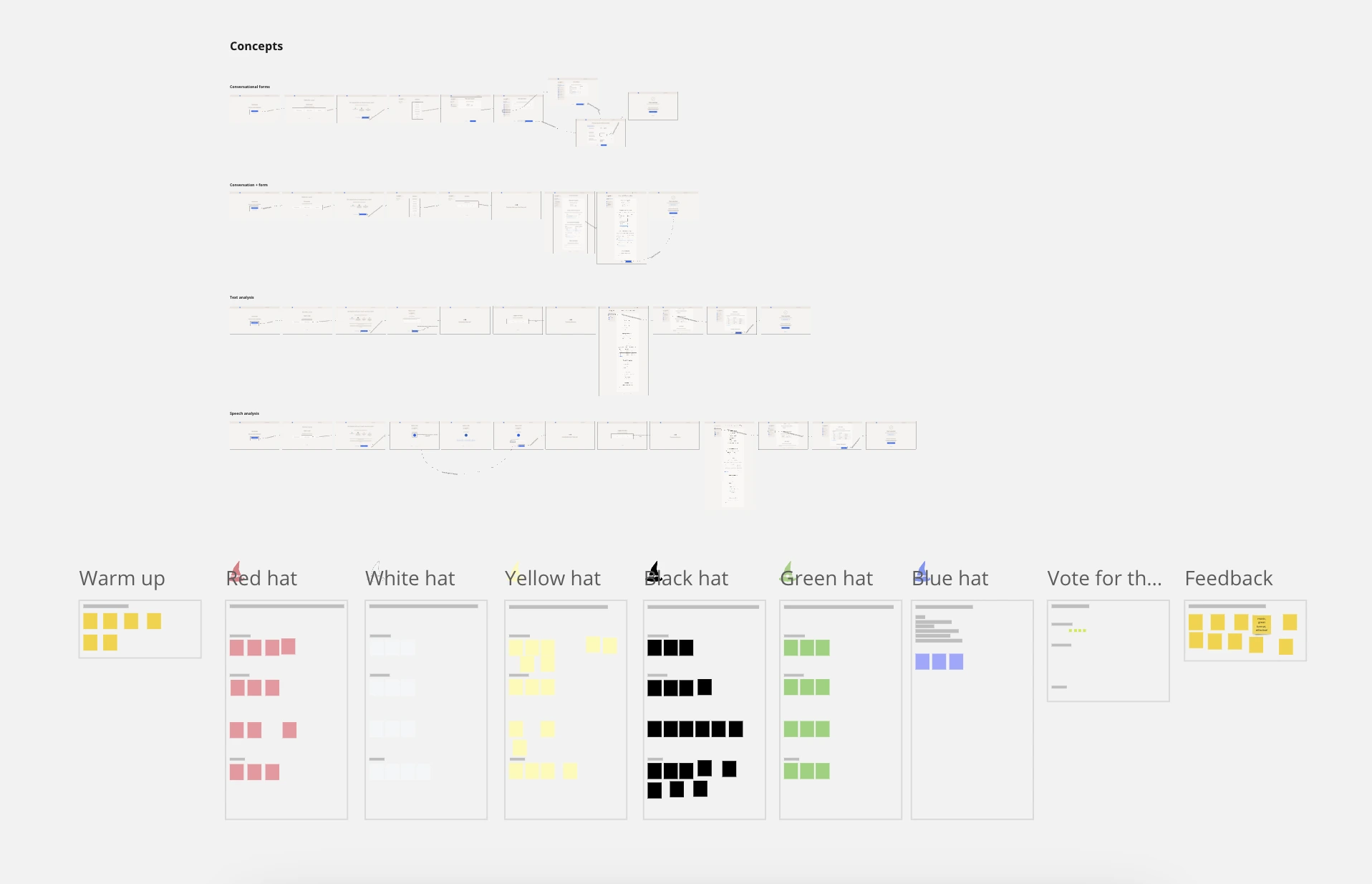
Design reviews can get boring, so I sometimes run them with de Bono’s six thinking hats. Everyone wears one hat at a time, so the black hat can be as grumpy as it likes without taking over the meeting.
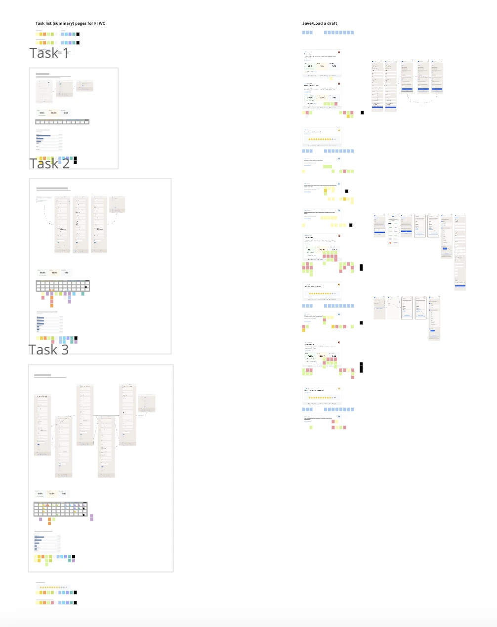
User test findings went to stakeholders as evidence, not opinions, and most of our decisions came out of those sessions.
Result
600k+ customers a year, happier customers when they report a claim, and adoption still growing across the company. The same forms can run on partner sites, in their own brands.
Looking back
It was a bumpy road, and it’s still the project I’m most proud of. Claim forms are complex: every answer changes the questions that follow, and people fill them in on a bad day. Getting them right meant understanding how people really use a product, not how we hoped they would. Complex, challenging and very rewarding.
What kept us going was the person on the other side. Someone reporting a claim after an accident should feel guided, not interrogated, and every round of testing brought the form a little closer to that.